Reviewing aggregate and benchmarking data
Raptor Maps aggregates your report data into a portfolio view.
Use this view to:
- Monitor the history of site inspections
- Assess the impact of anomalies on all sites
- Compare the aggregate results of your inspections against the complete Raptor Maps data set
This video provides an overview of this feature.
To access the Portfolio Overview, select Dashboard from the top menu bar:

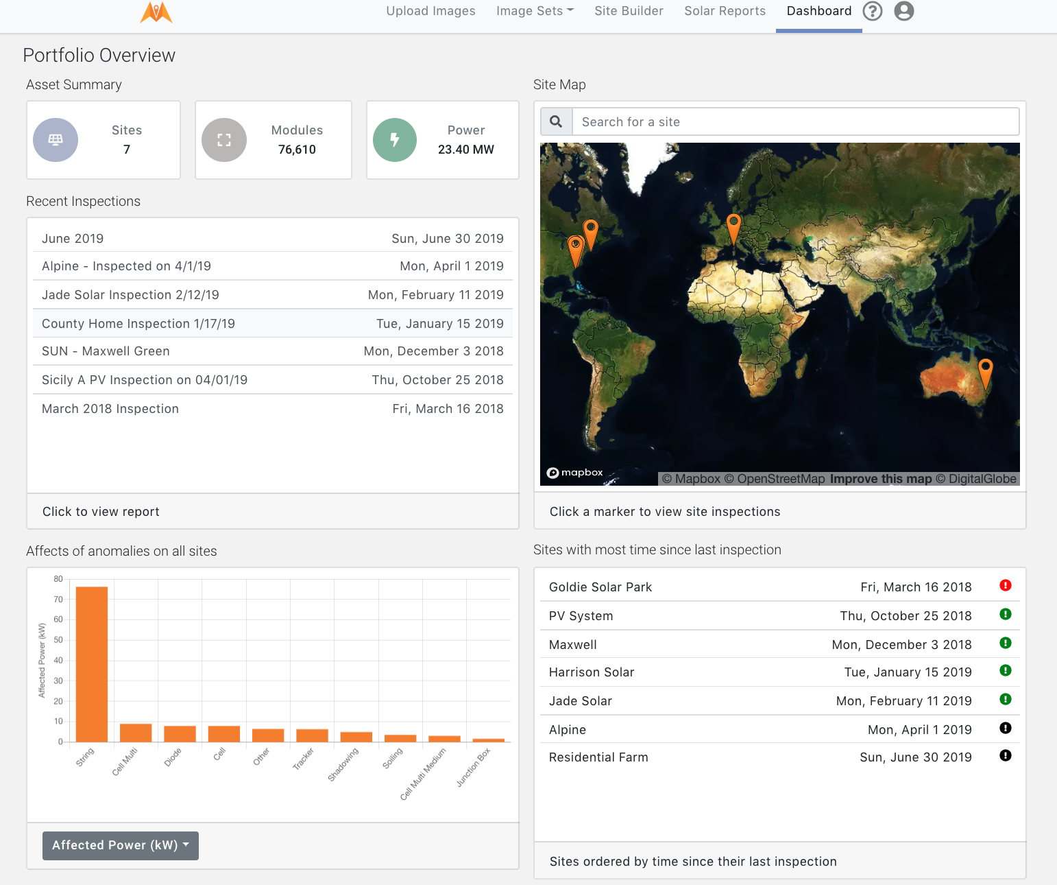
From the Portfolio Overview page, click on any recent inspection to access the associated report.
Use the list of sites with the most time since last inspection to assist you in prioritizing upcoming inspections.

Access the three views of Affects of anomalies on all sites graph by clicking on the grey button:
-
Affected Power (kW) breaks down power loss by anomaly type and kilowatts. This enables you to understand which anomaly types are most associated with power loss.
-
Affected Modules shows the count of affected modules for all sites by anomaly type. This view is helpful for high level maintenance planning.
-
Anomaly Count shows the number of anomalies for all sites by anomaly type. This is another view to assist with maintenance plans.
Note that the Anomaly count differs from the affected module count. For example, a string anomaly representing 19 modules per string receives an anomaly count of one, whereas for Affected modules the 19 modules per string would result in a count of 19 affected modules.
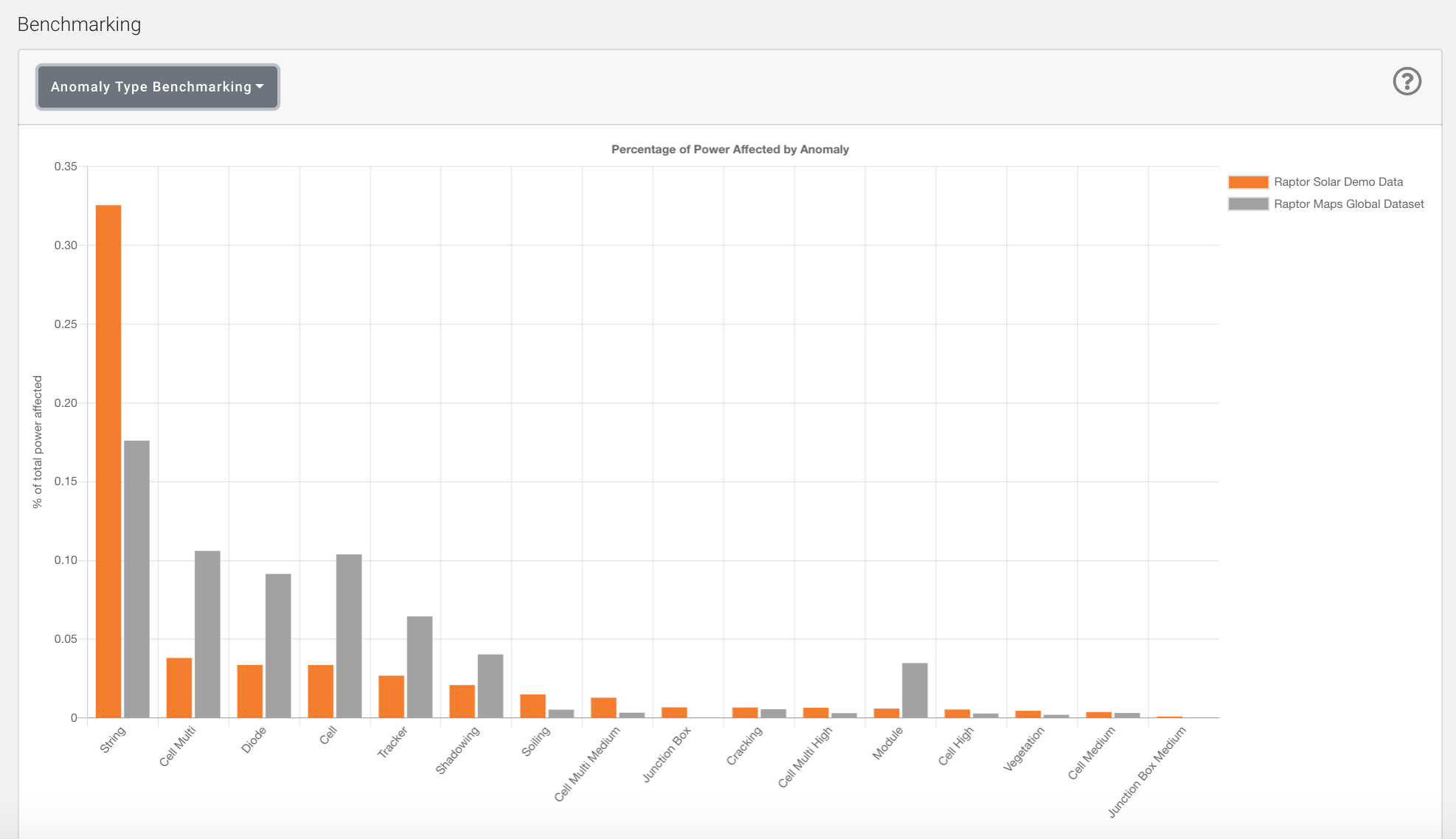
In addition, the Portfolio Overview provides a comparison of the impact of anomalies on your portfolio against the complete Raptor Maps dataset. Raptor Maps anonymizes data across six continents to pull together benchmarking information on each anomaly, then compares this against the inspections in your portfolio. This enables you to determine if your anomaly rate is higher or lower than average.

You can review benchmarking by anomaly or by module type:
-
Percentage of Power Affected by Anomaly compares the portion of your portfolio's total peak power potential impacted by specific anomaly types and compares it against all data in the Raptor Maps’ dataset.
-
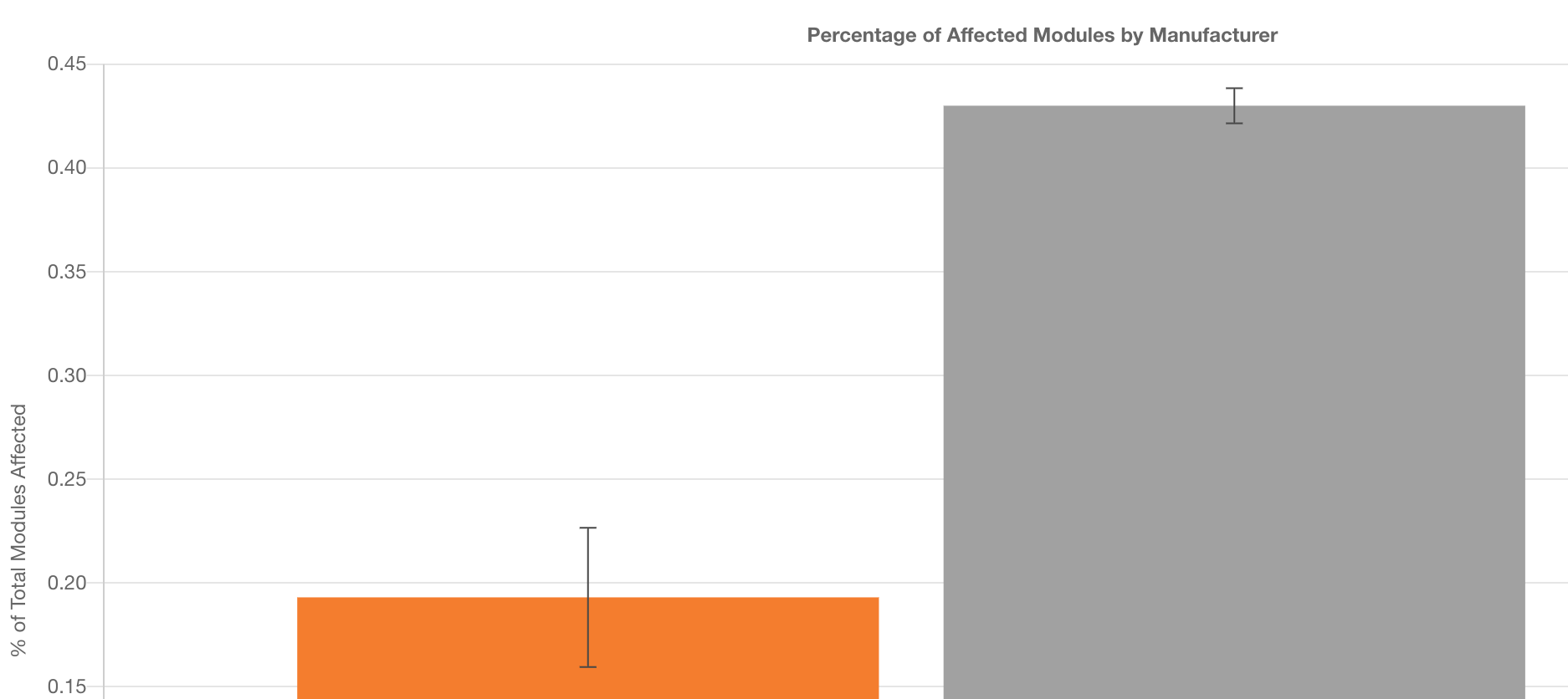
Percentage of Modules Affected by Manufacturer compares the portion of your portfolio's total peak power potential impacted by specific module types and compares it against all data in the Raptor Maps’ dataset.
Graphs for this benchmark include error bars. An error bar represents the confidence in the bar values. A larger error bar indicates less confidence in the shown value while a smaller error bar is indicative of more confidence in the value. The error is calculated using a standard binomial distribution.

The larger error bar on the orange bar indicates less confidence in the organization's dataset in comparison to the Raptor Maps Global Dataset.
Updated over 4 years ago
